

Market Data

July 8, 2017
U.S. Jobs Report Exceeds Expectations
Written by Tim Triplett
The U.S. employment situation continues to be good. Net job creation in June, including revisions for April and May, was 269,000, and the latest number of job openings was the highest on record.
The Bureau of Labor Statistics (BLS) net job creation report released on Friday exceeded economists’ expectations and was another example of why we should not be fixated on a single month’s result. On the face of it, March was terrible at only 50,000 more people employed than in February. In the data released on Friday, April was revised up by 33,000 to 207,000 and May was revised up by 14,000 to 152,000. The preliminary June result was 222,000 jobs created. Clearly the single month number is useless in its ability to measure the trend. The average monthly increase in the 12 months of July 2016 through June of 2017 was 187,000. Coincidentally, private employment increased 187,000 in June and government gained 35,000. The unemployment rate increased from 4.3 percent in May, which was the lowest since February 2001, to 4.4 percent in June.
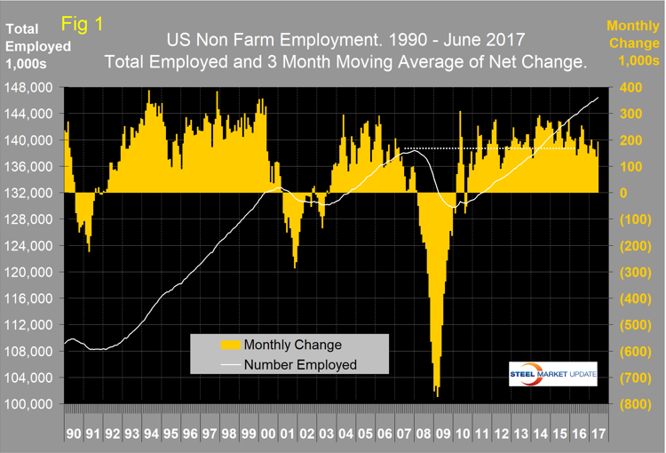
Figure 1 shows the 3MMA of the number of jobs created monthly as the brown bars since 1990. The white line tracks the number employed. There hasn’t even been a blip in the trajectory of this curve in the last six years. The results are seasonally adjusted by the BLS.
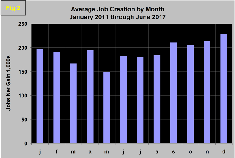
To examine if any seasonality is left in the data after adjustment, we have developed Figure 2. In the seven years since and including 2011, job creation in June has been up by 22.0 percent. This year, June was up by 46 percent, which is very encouraging. History says that July and August will be similar to June in spite of automotive re-tooling downtime.
Total nonfarm payrolls are now 8,039,000 more than they were at the pre-recession high of January 2008. November 2014 was the first month for total non-farm employment to exceed 140 million. At the end of June, 146,404,000 people were employed.
Table 1 breaks out the total number employed into private, government, service- and goods-producing industries and the change in those sectors in the latest month of data. It includes the percentage growth in three, 12 and 24 months. Most of the goods-producing employees work in manufacturing and construction. We have identified the components of these two sectors that are most relevant to steel consumption. In June, 187,000 jobs were created in the private sector and government gained 35,000. Not relevant to steel, but of interest from the point of view of where our tax dollars go, the federal government gained 4,000 as local governments gained 35,000 and state governments lost 4,000 jobs.
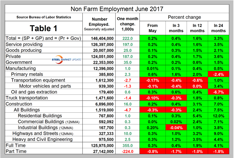
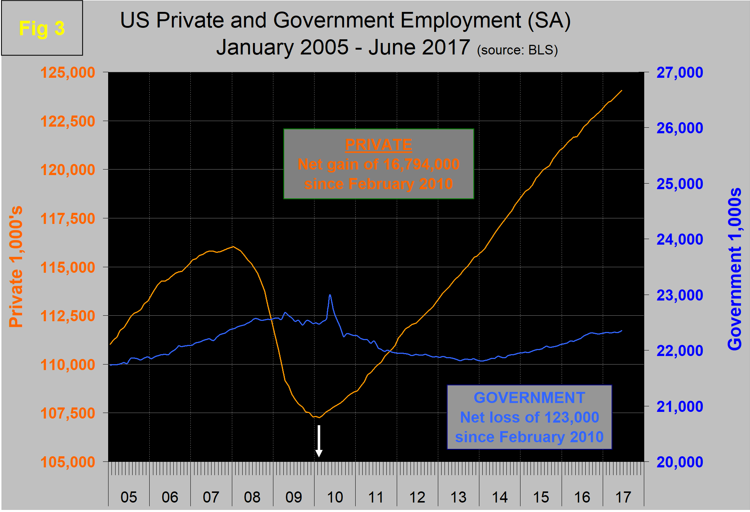
Since February 2010, the employment low point, private employers have added 16,794,000 jobs as government has shed 123,000 as shown in Figure 3. In June, service industries expanded by 197,000 as goods-producing industries driven by both construction and manufacturing expanded by 25,000. Since February 2010, service industries have added 14,291,000 and goods-producing 2,380,000 positions. This is part of the reason why wage growth has been slow since the recession, as service industries on average pay less than goods-producing such as manufacturing.
In June, manufacturing gained 1,000 positions for a total of 53,000 in the first six months of 2017. This was 0.4 percent higher than the same month in 2016 and 0.5 percent higher than in June 2015. Table 1 shows that primary metals have done much better than manufacturing as a whole in the last 12 months. Within the big picture of manufacturing, transportation equipment has lost ground, but oil and gas extraction have picked up the pace. Employment in motor vehicles and parts has been slowing for a year, which is probably recognition that auto sales have ended their post-recession recovery. Trucking was very strong in both February and March, but has lost ground in the last three months. Oil and gas extraction has made steady gains in the last 12 months. Note, the subcomponents of both manufacturing and construction shown in Table 1 don’t add up to the total because we have only included those that we think have most relevance to the steel industry.
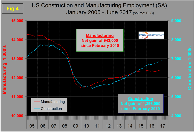
Construction was reported to have gained 16,000 jobs in June and is up by 113,000 in the first half of 2017. Some of the major construction subcategories are routinely reported one month in arrears, which distorts the data in Table 1. These include industrial buildings, commercial buildings, and highways and streets. Construction has added 1,396,000 jobs and manufacturing 943,000 since the recessionary employment low point in February 2010 (Figure 4). Construction has leapt ahead of manufacturing as a job creator, but the growth of construction productivity is very low (or non-existent), in contrast to manufacturing where it is very high. The difference is the difficulty of automating construction jobs.
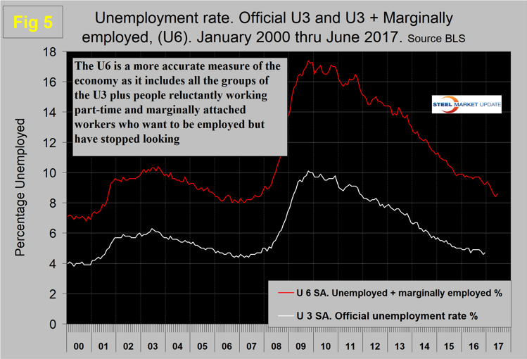
The official unemployment rate, U3, reported in the BLS’s household survey (see explanation below), came in at 4.4 percent in June, which was up from 4.3 percent in May but down from 4.9 percent in June last year. This number doesn’t take into account those who have stopped looking for work. The more comprehensive U6 unemployment rate declined from 9.6 percent in June 2016 to 8.6 percent in June 2017 (Figure 5). U6 includes workers working part time who desire full-time work and people who want to work but are so discouraged they have stopped looking. The differential between these rates was usually less than 4 percent before the recession, but is still 4.2 percent. It has been estimated that the economy needs to create about 150,000 jobs per month to keep up with population growth. In the last 12 months, the average monthly job creation has been 187,000, so the impact on unemployment has been about 37,000 per month.
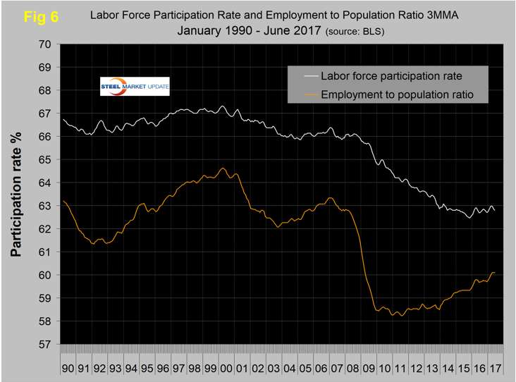
The employment participation rate at 62.8 percent in June hasn’t changed much in the last 12 months. We’re not sure what this is a percentage “of” because of the multiple descriptions of the labor pool. Another measure is the number employed as a percentage of the population, which we think is much more definitive. In June, this measure was 60.1 percent, up from 59.6 percent in June last year and from 59.3 percent in June 2015. The employment to population ratio has broken out of its 2016 slump in the last six months. Figure 6 shows both the participation rate and the employment to population ratio on the same graph.
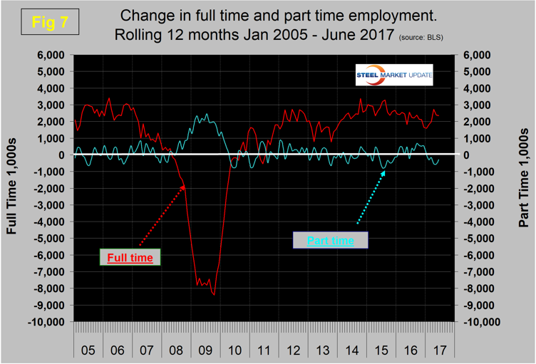
In the 30 months since and including January 2015, there has been an increase of 6,041,000 full-time and a decline of 364,000 part-time jobs. Figure 7 shows the rolling 12-month total change in both part-time and full-time employment. This data comes from the household survey in which part-time is defined as less than 35 hours per week. Because the full-time/part-time data comes from the household survey and the headline job creation number comes from the establishment survey, the two cannot be compared in any particular month. To overcome the volatility in the part-time numbers, we have to look at longer time periods than a month or even a quarter, which is why we look at a rolling 12 months for this component of the employment picture shown in Figure 7.
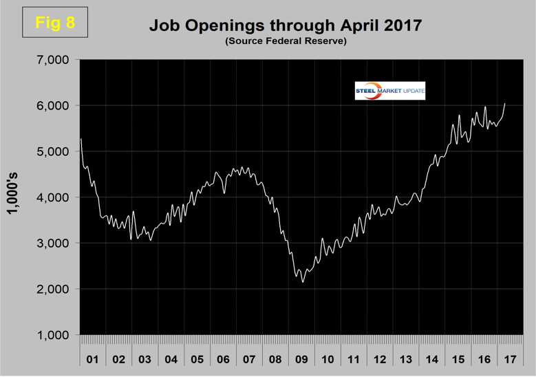
The job openings report known as JOLTS is reported on about the 10th of the month by the Federal Reserve and is over a month in arrears. Figure 8 shows the history of unfilled job openings through April when openings stood at 6,044,000, an all-time high. There has been an improving trend since mid-2009.
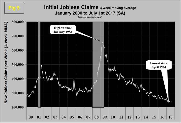
Initial claims for unemployment insurance, reported weekly by the Department of Labor, have continued their downward drift this year. In the week ending July 1, they were 248,000 with a four-week moving average of 243,000. This marks the longest streak since 1973 of initial claims below 300,000 (Figure 9). The result for the week ending Feb. 4, 2017, at 231,000, was the lowest in 43 years (April 1974).
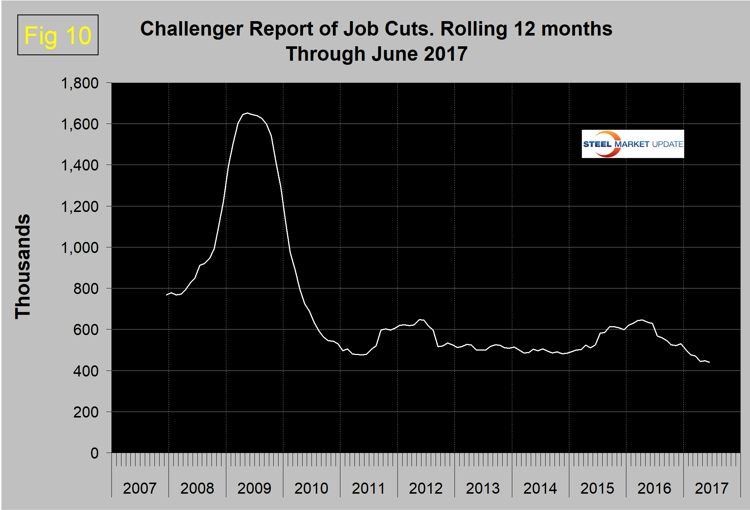
The last piece of the employment puzzle that we examine is the Challenger report, which measures job cuts monthly (Figure 10). This data also tends to be quite erratic, therefore we again examine a rolling 12 months and can see that job cuts decreased for most of 2016 and continued their downward trend in 2017. The result for June was the lowest since our data stream began at the end of 2007.
SMU Comment: The U.S. Gross Domestic Product is the values of goods and services produced by all economic activity. The growth of GDP is a function of the growth in the number of employed people multiplied by the growth of their productivity. Steel consumption is correlated to GDP, therefore to understand the direction of the steel market it is useful to know more about the growth in employment. The BLS monthly report of net job creation presents the big picture and enables us to drill down into sub sectors such as manufacturing and construction. This is therefore valuable in understanding the drivers of our particular steel business. The employment situation is good and has been described as “full” by some analysts. June 2017 was the 87th consecutive month of job growth on a 3MMA basis. The mid 90s was the longest sustained period of job growth since the 1940s when the streak was 96 months.
Explanation: On the first Friday of each month, the Bureau of Labor Statistics releases the employment data for the previous month. Data is available at www.bls.gov. The BLS reports on the results of two surveys. The Establishment survey reports the actual number employed by industry. The Household survey reports on the unemployment rate, participation rate, earnings, average workweek, the breakout into full-time and part-time workers and lots more details describing the age breakdown of the unemployed, reasons for and duration of unemployment. At SMU, we track the job creation numbers by many different categories. The BLS data base is a reality check for other economic data streams such as manufacturing and construction, and we include the net job creation figures for those two sectors in our “Key Indicators” report. It is easy to drill down into the BLS data base to obtain employment data for many sub sectors of the economy. For example, among hundreds of sub-indexes are truck transportation, auto production and primary metals production. The important point about each of these hundreds of data streams is in which direction they are headed. Whenever possible, we at SMU try to track three separate data sources for a given steel-related sector of the economy. We believe this gives a reasonable picture of market direction. The BLS data is one of the most important sources of fine grained economic data that we use in our analyses. Individual states also collect their own employment numbers independently of the BLS. The compiled state data compares well with the federal data. Every three months, SMU examines the state data and provides a regional report that indicates strength or weakness on a geographic basis. Reports by individual state can be produced on request.