

Market Data

June 7, 2016
Net Job Creation by Industry through May 2016
Written by Peter Wright
We normally reserve Employment articles for our Premium members but felt this would be a good piece to share with our Executive members as well.
The Bureau of Labor Statistics (BLS) reported on Friday in their analysis of non-farm employment that 38,000 jobs were added in May, a result so poor and unexpected as to be barely credible. To make matters worse March and April were revised down by 22,000 and 37,000, respectively. Mitigating circumstances were, first, the Verizon strike that removed about 34,000 from the employed pool and, secondly, that in the last six years May has been down by 28 percent from April. Even with those caveats, the May result was dismal and doesn’t jive with the other economic data that we study. An explanation of the BLS report is included at the end of this piece.
![]() As we have reported in our currency update, the Fed had hinted that the U.S. economy could be due for a rate hike in the coming months. The jobs data could tamp down such talks. Average hourly wages in May were up 2.5 percent Y/Y, but it might not be enough to overcome disappointing jobs growth. According to bond guru Bill Gross, the jobs report was enough of a shock to delay a June rate hike.
As we have reported in our currency update, the Fed had hinted that the U.S. economy could be due for a rate hike in the coming months. The jobs data could tamp down such talks. Average hourly wages in May were up 2.5 percent Y/Y, but it might not be enough to overcome disappointing jobs growth. According to bond guru Bill Gross, the jobs report was enough of a shock to delay a June rate hike.
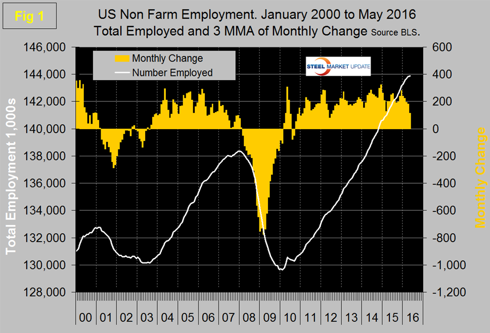
The three month moving (3MMA) of gains through May was 116,000, down from 181,000 in April. Figure 1 shows the decline in the 3MMA that has occurred during the course of this year.
The unemployment rate, U3, calculated from a different survey, declined to 4.7 percent in May from 5.0 percent in April. This counter intuitive move resulted from less people looking for work. These numbers are seasonally adjusted by the BLS so to examine if any seasonality is left in the data after adjustment we have developed Figure 2 which suggests that the adjustment is less than perfect.
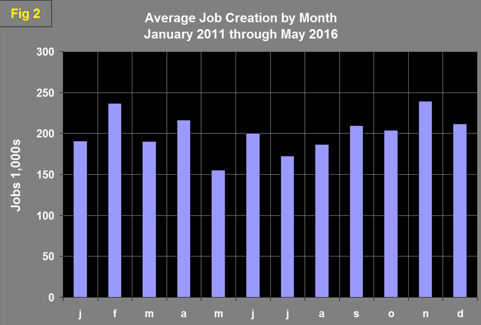
On average since 2011 May’s number of jobs created has decreased by 28 percent from April, on a seasonally adjusted basis, this year there was a 69 percent decrease. Eliminating the Verizon effect, job creation was still down by 41 percent in May. Total nonfarm payrolls are now 5,529,000 more than they were at the pre-recession high of April 2008.
Table 1 slices total employment into service and goods producing industries and then into private and government employees.
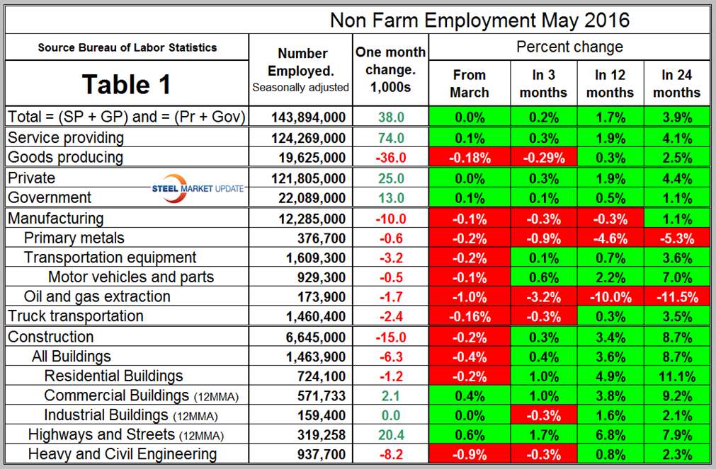
Total employment equals the sum of private and government employees. It also equals the sum of goods producing and service employees. Most of the goods producing employees work in manufacturing and construction and the major components of these two sectors are also shown in Table 1. In May, 25,000 jobs were created in the private sector and 13,000 in government. The Federal government gained 12,000 as state governments lost 7,000 and local governments gained 8,000. Since February 2010, the employment low point, private employers have added 14,548,000 jobs as government has shed 387,000. In May service industries expanded by 74,000 as goods producing industries lost 36,000 people. Since February 2010, service industries have added 12,163,000 and goods producing 1,998,000 positions. This is part of the reason for stagnant wage growth since service industries on average pay less than goods producing such as manufacturing.
In May manufacturing lost 10,000 jobs and total manufacturing employment was 0.3 percent less than a year ago. Since January 2015, manufacturing has lost 26,000 jobs. In the same time frame, primary metals has lost 31,000 jobs and has had only one positive month out of the last seventeen. Table 1 shows that in May there were no positive results in the five sectors that we examine. Note the subcomponents of both manufacturing and construction shown in Table 1 don’t add up to the total because we have only included those that have most relevance to the steel industry.
Construction was reported to have lost 15,000 jobs in May which along with the downwardly revised April were the only months of construction job contraction since March last year. The construction data in particular makes no sense in the light of the very good construction expenditures report (CPIP) issued by the Department of Commerce and which we reported on last week. The Associated General Contractors of America had this to say in their blog dated June 1st. Data reflects relatively strong market conditions for the construction sector. “While few cities have returned to their prior peak levels, construction head counts continue to climb in most areas,” said Stephen E. Sandherr, the association’s chief executive officer. Some of the major construction sub categories are routinely reported one month in arrears which distorts the data in Table 1. These include, industrial buildings, commercial buildings and highways and streets. Construction has added 1,145,000 jobs and manufacturing 832,000 since the recessionary employment low point in February 2010 (Figure 3).
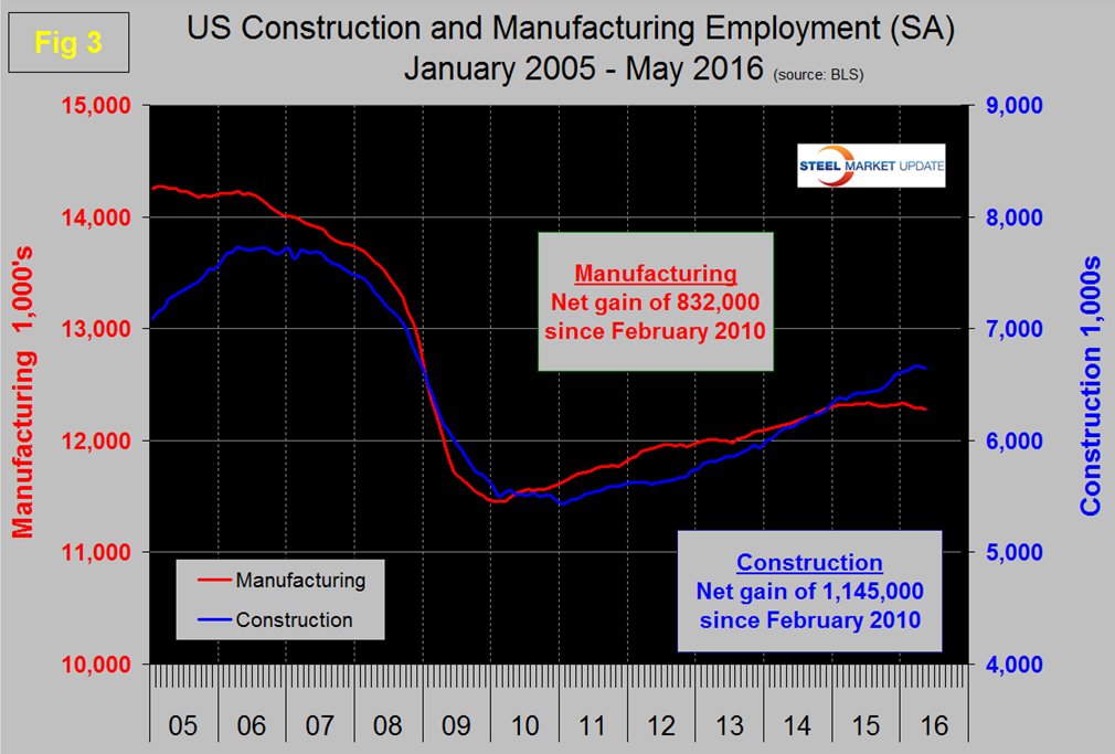
Construction has leapt ahead of manufacturing as a job creator but the growth of construction productivity is very low (or nonexistent), in contrast to manufacturing where it is very high. The difference is the difficulty of automating construction jobs.
The official unemployment rate known as U3, decreased from 5.5 percent in May last year to 4.9 percent in January and February before increasing again to 5.0 percent in March and April then declining again to 4.7 percent in May. This number doesn’t take into consideration those who have stopped looking. The more comprehensive U6 unemployment rate decreased from 11.3 percent in January 2015 to 9.7 percent in April and May this year (Figure 4).
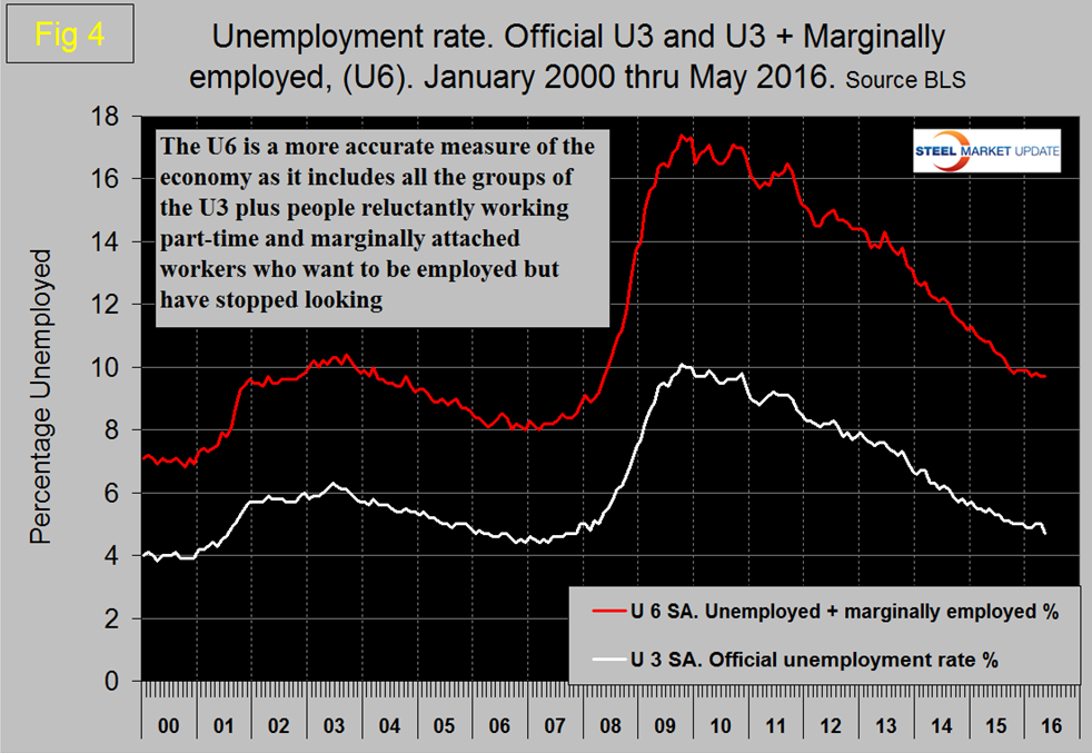
U6 includes workers working part time who desire full time work and people who want to work but are so discouraged that they have stopped looking. The differential between these rates was usually less than 4 percent before the recession but is still 5.0 percent.
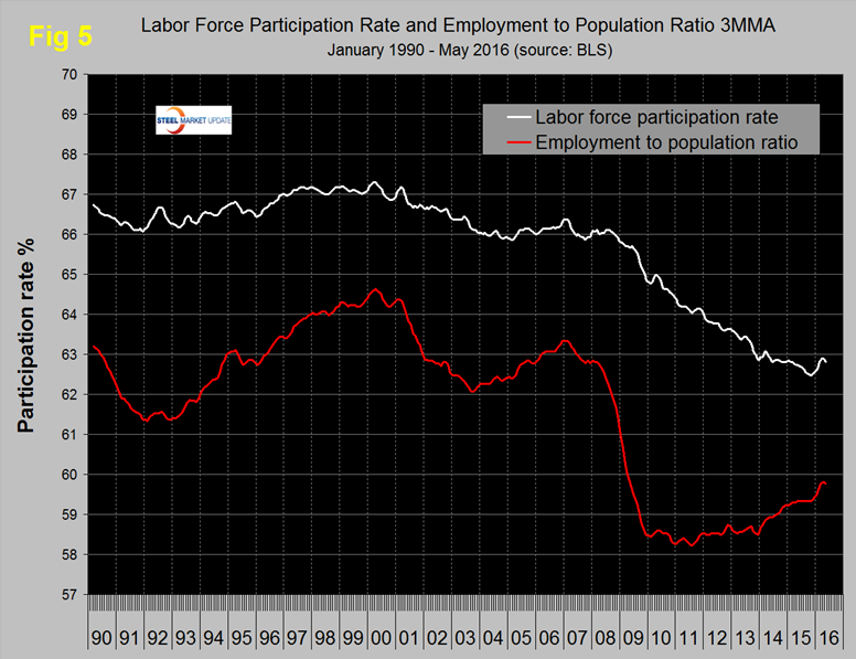
The employment participation rate is widely quoted in the press as going nowhere. In May 2016 the rate was 62.6 percent, down from 62.8 percent in April. We’re not sure that we understand what this is a percentage “of” because of the multiple descriptions of the labor pool. Another measure is the number employed as a percentage of the population which we think is much more definitive. In May this measure stood at 59.7 percent which was the same as April but down from 59.9 percent in March. Figure 5 shows both measures on one graph.
Since and including January 2015 there has been an increase of 3,201,000 full time and of 430,000 part time jobs. Figure 6 shows the rolling 12 month total change in both part time and full time employment.
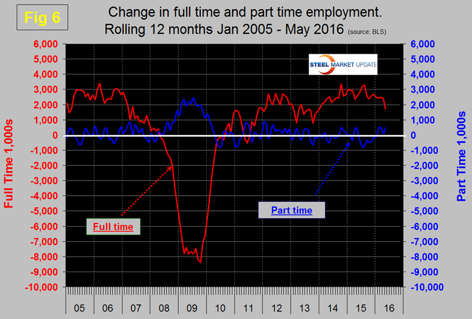
Frequently in the press we read that a large part of job creation is in part time employment. In past SMU analyses we have reported that this is not the case and that the part-time numbers are extremely volatile. To overcome that volatility we have to look at longer time periods than a month or even a quarter to get the picture. However this month we have to reverse our previous observations and report that even on a rolling 12 month analysis there was a significant deterioration in full time and a pickup in part time employment in May.
The job openings report known as JOLTS is reported on about the 10th of the month by the Federal Reserve and is over a month in arrears. Figure 7 shows the history of unfilled job openings which have skyrocketed in the last two years to levels not seen since the data series was initiated in 2000.
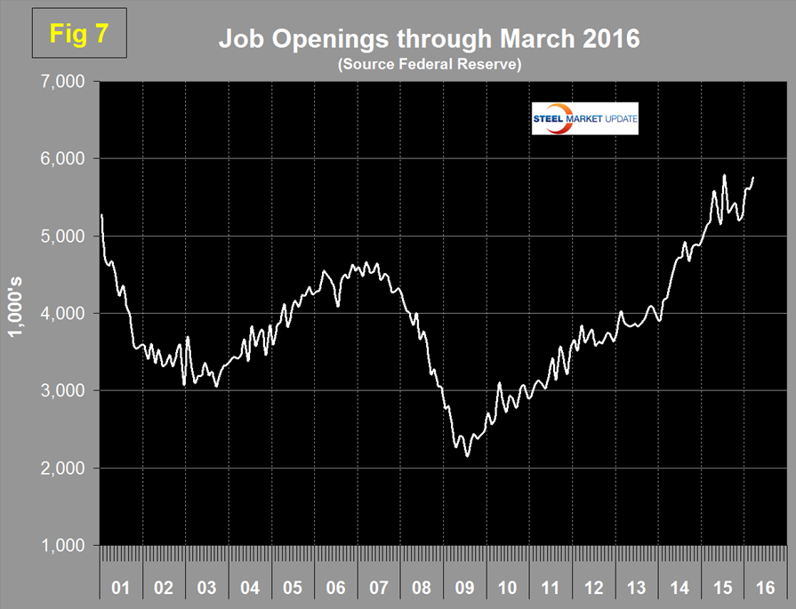
The previous high was 5.25 million at the end of 2000; in the last two years we have seen a surge from 3.906 million in January 2014 to 5.757 million in the latest report for March 2016.
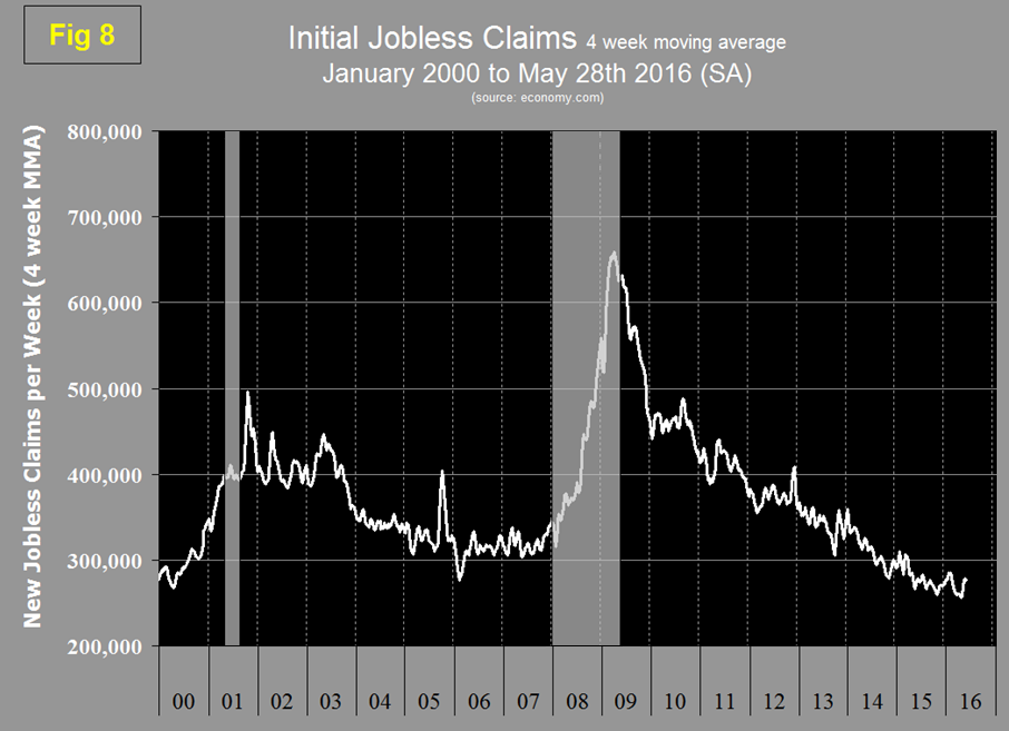
Initial claims for unemployment insurance have been relatively consistent for the last year. We have weekly data through May 28th therefore nicely covering the time period of this latest employment report from the BLS. The four week moving average of new claims at the end of May was down by 7,000 from the end of April (Figure 8).
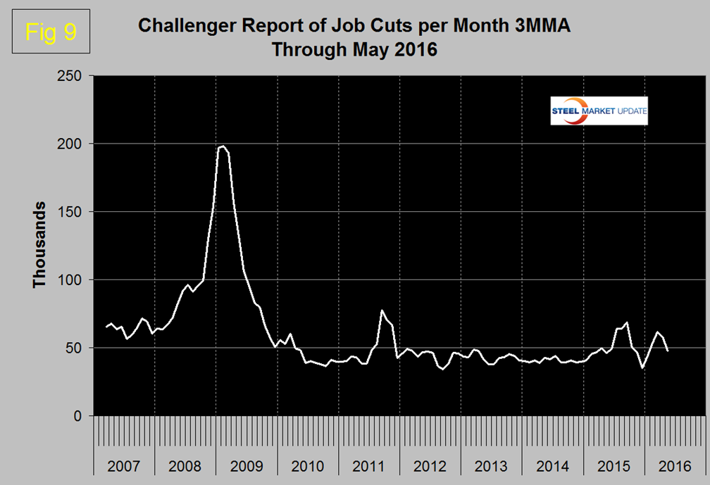
Finally we examined the Challenger report to see if there had been an increase in job cuts in May. There wasn’t! (Figure 9)
SMU Comment: As you the reader will have gathered we are skeptical about this latest employment report. Unfortunately there is a lot riding on the data, not least the value of the US dollar which is driven significantly by the differential between US interest rates and those of the other major global economies.
Explanation: On the first Friday of each month the Bureau of Labor Statistics releases the employment data for the previous month. Data is available at www.bls.gov. At SMU we track the job creation numbers by many different categories. The BLS data base is an excellent reality check for other economic data streams such as manufacturing and construction and we include the net job creation figures for those two sectors in our “Key Indicators” report. It is easy to drill down into the BLS data base to obtain employment data for many sub sectors of the economy. For example, among hundreds of sub-indexes are truck transportation, auto production and primary metals production. The important point about each of these hundreds of data streams is in which direction they are headed. Whenever possible we at SMU try to track three separate data sources for a given steel related sector of the economy. We believe this gives a reasonable picture of market direction. The BLS data is one of the most important sources of fine grained economic data that we use in our analyses. The States also collect their own employment numbers independently of the BLS. The compiled state data compares well with the federal data. Every three months SMU examines the state data and provides a regional report which indicates strength of weakness on a geographic basis. Reports by individual state can be produced on request.