

Market Data

August 12, 2016
Net Job Creation by Industry through July 2016
Written by Peter Wright
At SMU we almost always use three month moving averages to mitigate situations like the dismal and not credible May job creation statistics. In the July report May was revised up slightly from 11,000 to 24,000 and June was revised up from 287,000 to 292,000.
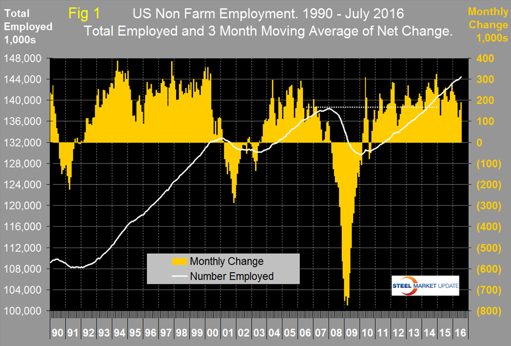
![]() This week’s report from the Bureau of Labor Statistics reported that 255,000 jobs were created in July. Using a 3MMA, the result for July was 190,000 which didn’t entirely wipe out the May aberration but it did make it look a lot more credible. Figure 1 shows the 3MMA of the number of jobs created as the brown bars since 1990 and it is evident that there was a decline in 2015 that continued into this year.
This week’s report from the Bureau of Labor Statistics reported that 255,000 jobs were created in July. Using a 3MMA, the result for July was 190,000 which didn’t entirely wipe out the May aberration but it did make it look a lot more credible. Figure 1 shows the 3MMA of the number of jobs created as the brown bars since 1990 and it is evident that there was a decline in 2015 that continued into this year.
These numbers are seasonally adjusted by the BLS so to examine if any seasonality is left in the data after adjustment we have developed Figure 2.
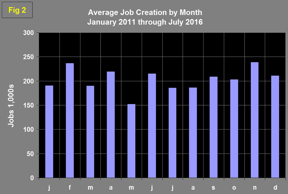
The January dip is a weather effect and July is depressed by automotive plant re-tooling but we have no explanation for the historic May decline. Evidently the seasonal adjustment is less than perfect. Historically July declines by 14 percent from June, this year the decline was 13 percent. Total nonfarm payrolls are now 6,083,000 more than they were at the pre-recession high of January 2008.
Table 1 slices total employment into service and goods producing industries and then into private and government employees.
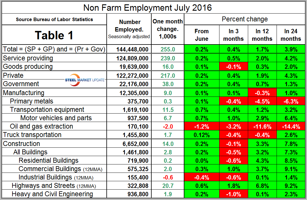
Total employment equals the sum of private and government employees. It also equals the sum of goods producing and service employees. Most of the goods producing employees work in manufacturing and construction and the major components of these two sectors are also shown in Table 1. In July, 217,000 jobs were created in the private sector and 38,000 in government. The Federal government gained 3,000 as state governments gained 5000 and local governments gained 30,000. Since February 2010, the employment low point, private employers have added 15,015,000 jobs as government has shed 300,000. In July service industries expanded by 239,000 as goods producing industries gained 16,000 people. Since February 2010, service industries have added 12,703,000 and goods producing 2,012,000 positions. This is part of the reason for stagnant wage growth since service industries on average pay less than goods producing such as manufacturing.
In July manufacturing gained 9,000 jobs but for the year as a whole is down by 15,000. On a positive note June and July were the first back to back months of manufacturing employment gains this year. In July total manufacturing employment was 0.3 percent less than a year ago but 1.0 percent higher than two years ago. Primary metals had positive job creation in July for the first time since June last year but is down by 8,000 ytd 2016. Table 1 shows that in July all the sectors of manufacturing that we identify were positive except for oil and gas extraction. Note the subcomponents of both manufacturing and construction shown in Table 1 don’t add up to the total because we have only included those that we think have most relevance to the steel industry.
Construction was reported to have added 14,000 jobs in July. April, May and June were the only months to have a contraction in construction employment since March last year. The construction employment data is not as positive as the construction expenditures report (CPIP) issued by the Department of Commerce and which we reported on last week. This maybe, as the Associated General Contractors of America continue to report, because of a lack of availability of skilled workers which is being ameliorated by longer work weeks.
Some of the major construction sub categories are routinely reported one month in arrears which distorts the data in Table 1. These include, industrial buildings, commercial buildings and highways and streets. Construction has added 1,152,000 jobs and manufacturing 852,000 since the recessionary employment low point in February 2010 (Figure 3).
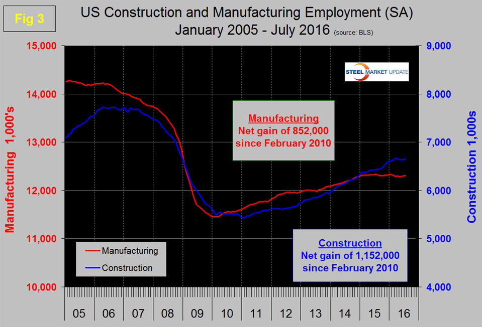
Construction has leapt ahead of manufacturing as a job creator but the growth of construction productivity is very low (or non-existent), in contrast to manufacturing where it is very high. The difference is the difficulty of automating construction jobs.
The official unemployment rate, U3, calculated from a different survey, was unchanged at 4.9 percent in July and up from 4.7 percent in May. This number doesn’t take into account those who have stopped looking. The more comprehensive U6 unemployment rate increased from 9.6 percent in June to 9.7 percent in July (Figure 4).
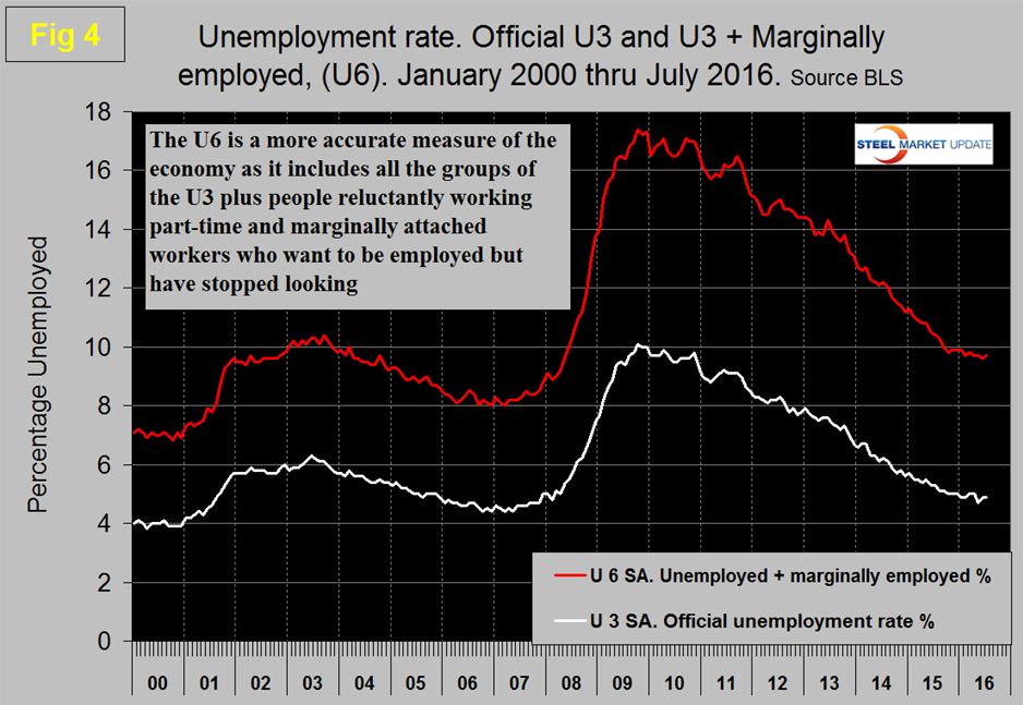
U6 includes workers working part time who desire full time work and people who want to work but are so discouraged that they have stopped looking. The differential between these rates was usually less than 4 percent before the recession but is still 4.8 percent.
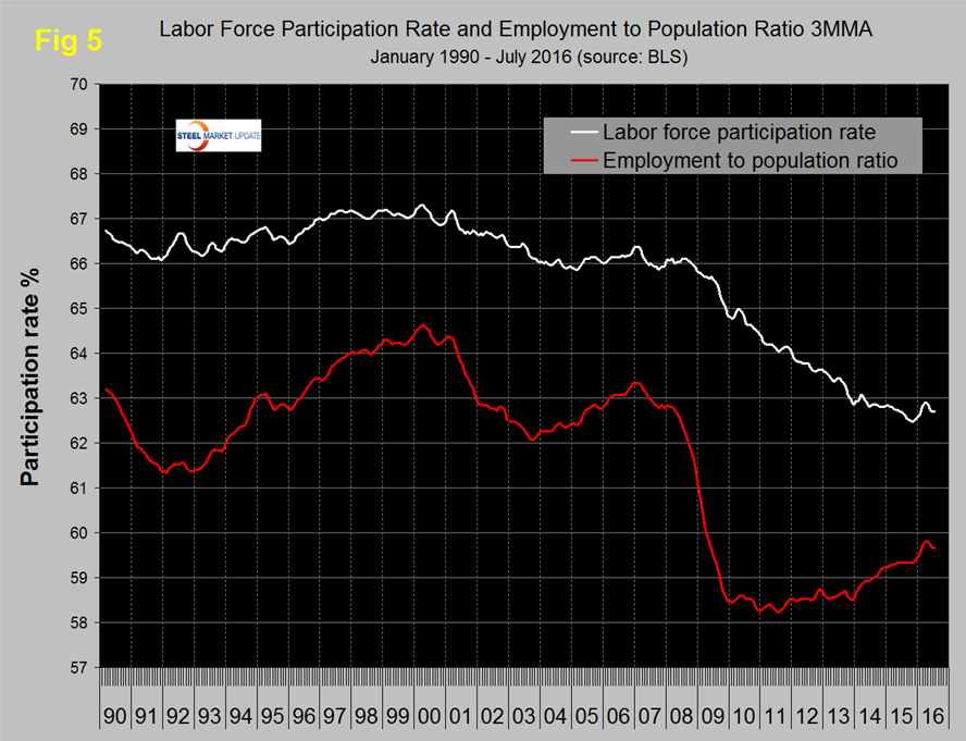
The employment participation rate is widely quoted in the press as going nowhere. In July 2016 the rate was 62.8 percent, with a 3MMA of 62.7 percent down from 62.9 percent in April. We’re not sure that we understand what this is a percentage “of” because of the multiple descriptions of the labor pool. Another measure is the number employed as a percentage of the population which we think is much more definitive. In July this measure stood at 59.7 percent with a 3MMA also of 59.7 percent which was down from 59.8 percent in March through May. Figure 5 shows both measures on one graph.
In the 19 months since and including January 2015 there has been an increase of 3,958,000 full time and 89,000 part time jobs. Figure 6 shows the rolling 12 month total change in both part time and full time employment.
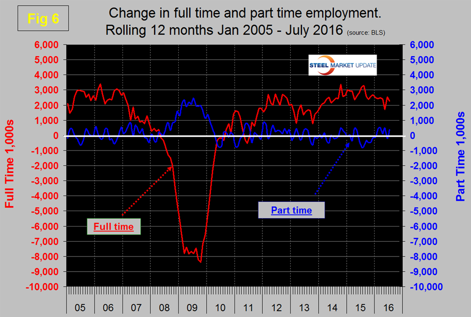
Frequently in the press we read that a large part of job creation is in part time employment which in some months is true but the part-time numbers are extremely volatile. To overcome the volatility we have to look at longer time periods than a month or even a quarter which is why we look at a rolling 12 months for this component of the employment picture.
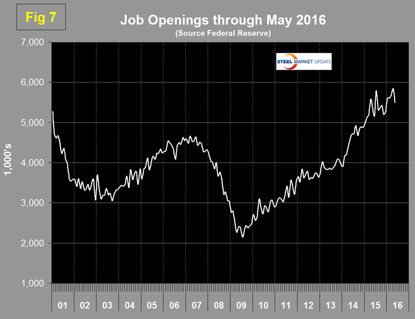
The job openings report known as JOLTS is reported on about the 10th of the month by the Federal Reserve and is over a month in arrears. Figure 7 shows the history of unfilled job openings through May. Openings declined in May but are still at a historically very high level.
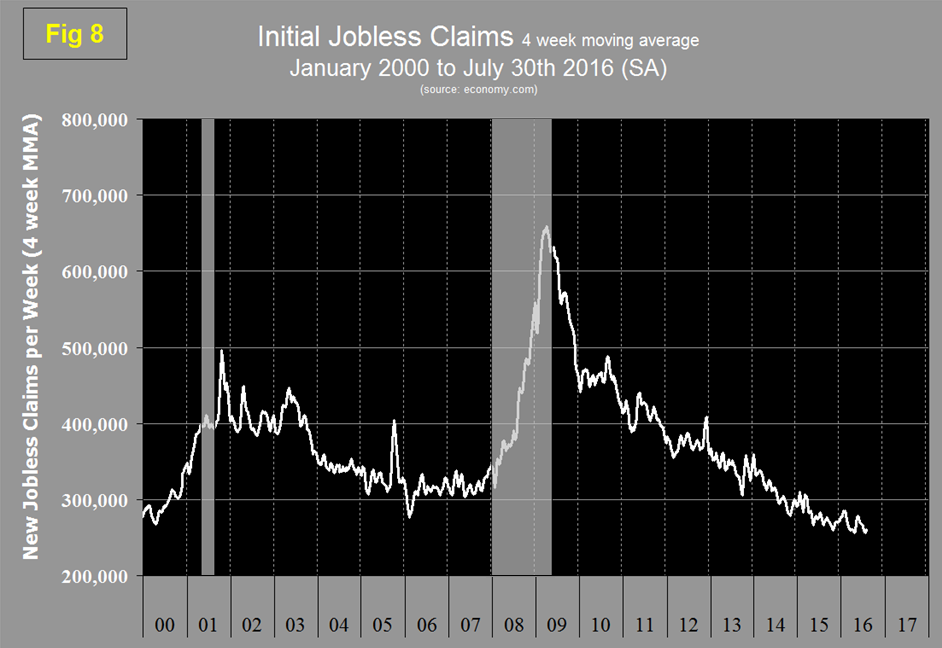
Initial claims for unemployment insurance, reported weekly by the Department of Labor (DOL) have continued their downward drift this year and in w/e July 30th were 260,250 on a four week moving average basis. The DOL stated, “There were no special factors impacting this week’s initial claims. This marks 74 consecutive weeks of initial claims below 300,000, the longest streak since 1973.” (Figure 8).
The last piece of the employment puzzle that we examine is the Challenger report which measures job cuts monthly (Figure 9).
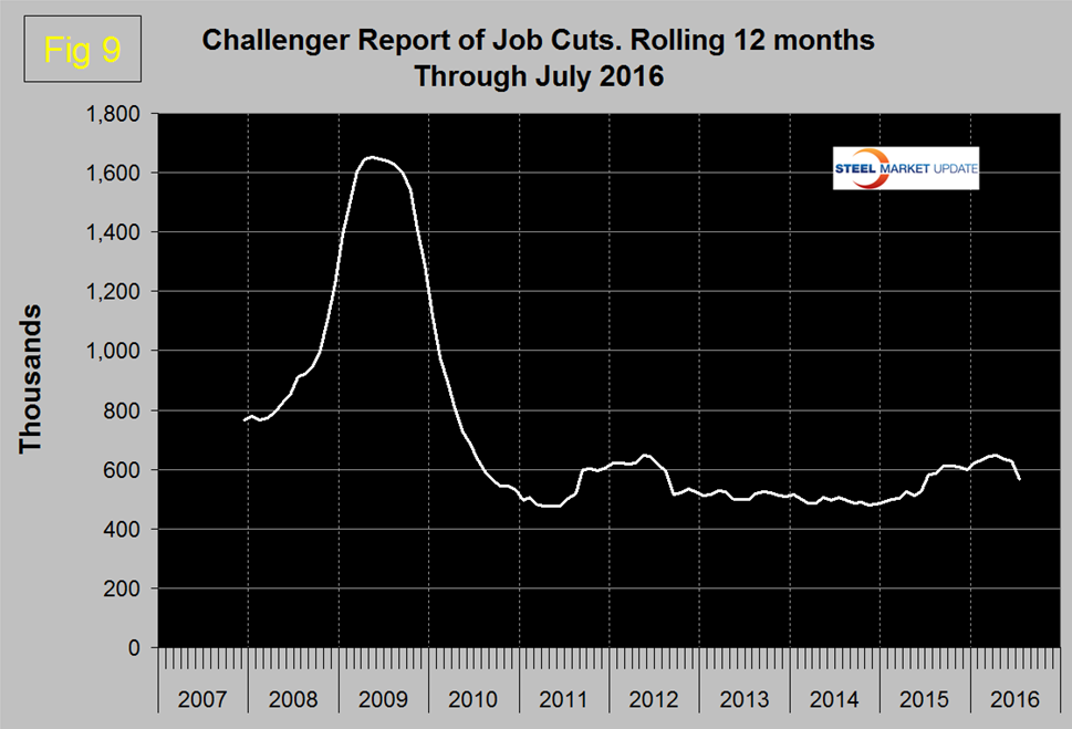
This data also tends to be quite erratic therefore again we examine a rolling 12 months and can see that job cuts increased from late 2014 through April this year, declined in May and June and dived in July.
SMU Comment: Net job creation has recovered from the dismal and unbelievable May report and results for both manufacturing and construction were positive in July. Our data for the ISM manufacturing report and for construction expenditures are both positive though construction appears to be slowing. Overall these employment statistics are encouraging for steel demand into the fourth quarter.
Explanation: On the first Friday of each month the Bureau of Labor Statistics releases the employment data for the previous month. Data is available at www.bls.gov. At SMU we track the job creation numbers by many different categories. The BLS data base is a reality check for other economic data streams such as manufacturing and construction and we include the net job creation figures for those two sectors in our “Key Indicators” report. It is easy to drill down into the BLS data base to obtain employment data for many sub sectors of the economy. For example, among hundreds of sub-indexes are truck transportation, auto production and primary metals production. The important point about each of these hundreds of data streams is in which direction they are headed. Whenever possible we at SMU try to track three separate data sources for a given steel related sector of the economy. We believe this gives a reasonable picture of market direction. The BLS data is one of the most important sources of fine grained economic data that we use in our analyses. The States also collect their own employment numbers independently of the BLS. The compiled state data compares well with the federal data. Every three months SMU examines the state data and provides a regional report which indicates strength of weakness on a geographic basis. Reports by individual state can be produced on request.