

Market Data

February 10, 2020
January Job Creation Numbers Encouraging
Written by Peter Wright
Net job creation in January was an encouraging 225,000, up from 147,000 in November, but down from the exceptional result of 261,000 in October. In the January report, the Bureau of Labor Statistics (BLS) made substantial historical revisions. In this SMU analysis, we revised our data back to January 2017. Rising employment and wages are the main contributors to GDP growth because personal consumption accounts for almost 70 percent of GDP. Steel consumption is related to GDP; therefore this is one of the indicators that help us understand the reality of the steel market.
![]()
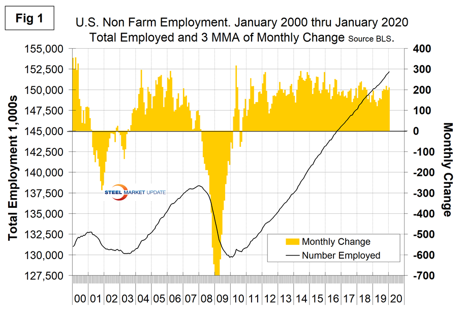
Figure 1 shows the three-month moving average (3MMA) of the number of jobs created monthly since 2000 as the brown bars and the total number employed as the black line.
Economy.com summarized as follows: “The year started off on a strong note with payrolls increasing by 225,000 jobs. Not surprisingly, the mild winter bolstered construction payrolls. Education/healthcare and leisure/hospitality also contributed to the strong gains. However, additions were very uneven across industries. Hourly earnings perked up, up 7 cents or 3.1 percent over the year. The unemployment rate increased to 3.6 percent as labor force participation rose to a cyclical high of 63.4 percent.”
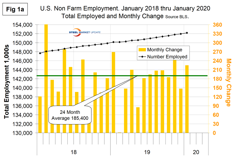
Figure 1a shows the raw monthly data since January 2018. Last month we reported that the variability has been worse in 2019 than it was in 2018. Clearly, based on the revisions, this is not the case, and the last eight months through January look very solid. Before the revisions, the average monthly job creation in 2018 was 223,300, and in 2019 was 175,700. The revised figures are 192,800 for 2018 and 174,700 for 2019. Therefore, 2018 was revised down by an average of 30,500 per month and 2019 down by only 1,000 per month.
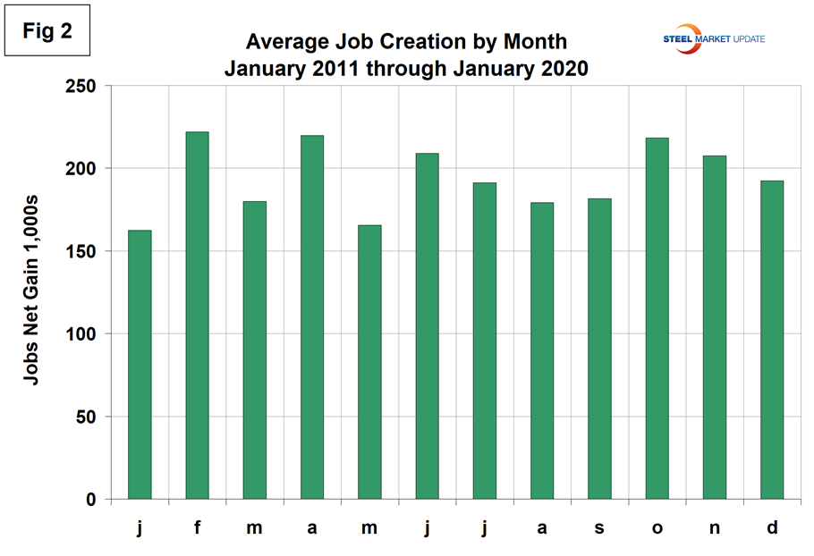
The employment data has been seasonally adjusted. We have developed Figure 2 to examine if any seasonality is left in the data after adjustment. We think it’s significant to look at the results this way because there is so much variability in the numbers that a long-term context is necessary. It doesn’t look as though the BLS’s seasonal adjustment is very effective. In the 10 years since and including 2011, the average month-on-month change from December to January has been negative 15.6 percent. This year the change was positive 53.1 percent, partly because of the distorting effect of the GM strike in the fourth quarter.
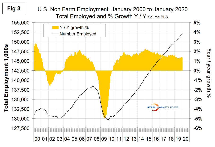
In order to get another look at the degree of change, we have developed Figure 3. This shows the same total employment line as Figure 1, but includes the year-over-year growth on a percentage basis. This presentation shows more clearly the rate of change that has occurred in each of the preceding years. Considering the variability of the raw monthly data, we think the year-over-year view is the best way to evaluate what’s really going on.
According to the latest BLS economic news release, in January, average hourly earnings for all employees on private nonfarm payrolls rose by 7 cents to $28.44. Over the past 12 months, average hourly earnings have increased by 3.1 percent. Average hourly earnings of private-sector production and nonsupervisory employees were $23.87 in January, little changed over the month (+3 cents). The average workweek for all employees on private nonfarm payrolls was unchanged at 34.3 hours in January. In manufacturing, the average workweek remained at 40.4 hours, while overtime edged down 0.1 hour to 3.1 hours. The average workweek of private-sector production and nonsupervisory employees edged up by 0.1 hour to 33.6 hours.
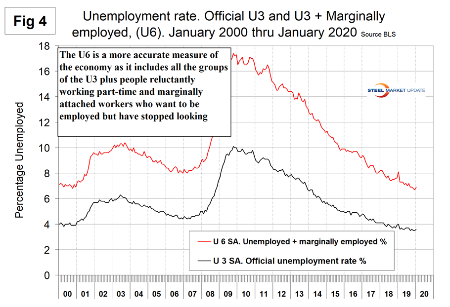
The official unemployment rate (U3) reported in the BLS Household survey (see explanation below) declined from 3.7 percent in June, July and August to 3.5 percent in November and December before increasing to 3.6 percent in January. U3 has ranged from 3.5 to 4.0 percent in each of the last 18 months. This is not a very representative number. The more comprehensive U6 unemployment rate at 6.9 percent was down from 8.1 in January (Figure 4). The difference between these two measures in January was 3.3 percent, which is historically excellent and the lowest since April 2001. U6 includes individuals working part time who desire full-time work and those who want to work but are so discouraged they have stopped looking.
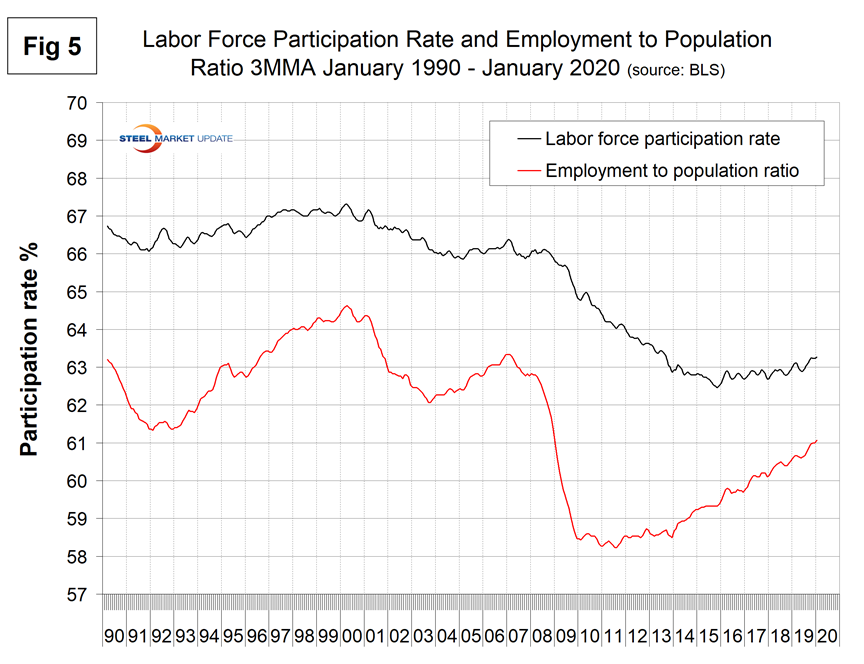
The labor force participation rate is calculated by dividing the number of people actively participating in the labor force by the total number of people eligible to participate. This measure was 63.4 percent in January and hasn’t changed much in three years. Another gauge is the number employed as a percentage of the population, which we think is more definitive. In January, the employment-to-population ratio was 61.2 percent, the best result since November 2008. Figure 5 shows both measures on one graph.
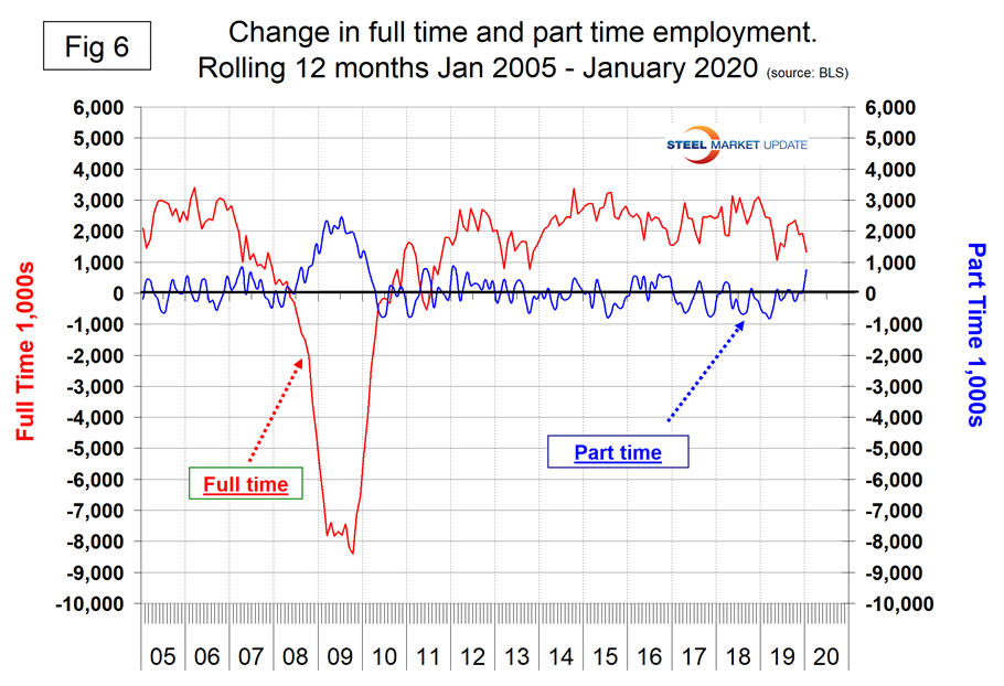
In the 49 months since and including January 2016, there has been an increase of 8,359,000 full-time and an increase of 131,000 part time employees. Figure 6 shows the rolling 12-month change in both part-time and full-time employment. There were historically huge swings in this data in the January report with full-time employees declining by 656,000 and part-time increasing by 537,000. This data comes from the Household survey and part-time is defined as less than 35 hours per week. Because the full-time/part-time data comes from the Household survey and the headline job creation number comes from the Establishment survey, the two cannot be compared in any given month. To overcome the volatility in the part-time numbers, we look at a rolling 12 months for both the full-time and part-time employment picture shown in Figure 6.
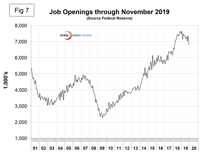
The job openings report known as JOLTS is reported on about the 10th of the month by the Federal Reserve and is over a month in arrears. In the January employment report, JOLTS data was reported for November. Figure 7 shows the history of unfilled jobs. In November, openings stood at 6,800,000, which was still historically high but down from 7,625,000 in January 2019.
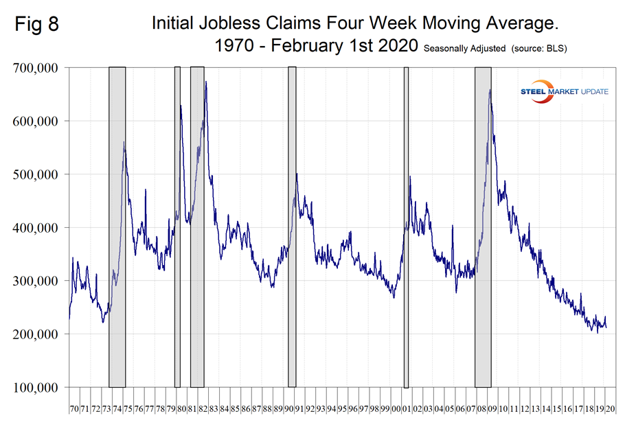
Initial claims for unemployment insurance, reported weekly by the Department of Labor, have been exceptionally low since 2014. The U.S. is enjoying the longest streak since 1973 of initial claims below 300,000 (Figure 8). This data stream is part of our recession outlook report and at present shows no sign of an imminent problem.
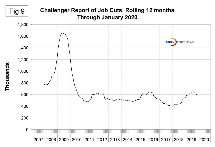
Challenger Grey and Christmas Inc. produces a monthly report of job cuts in the U.S. Job cuts were 67,700 in January, which was the highest since October 2018. Figure 9 shows the rolling 12 months of job cuts since December 2007. We use a rolling 12 months because the high variability of this data makes the trend difficult to visualize from a monthly chart or even from a 3MMA. Economy.com reported: “Job cuts increased sharply to 67,735 in January, more than double the figure a month earlier and 28 percent higher than the figure a year earlier. Technology and retail posted the largest layoffs, accounting for more than one-third of total job cuts. While the production stoppage of Boeing’s 737 MAX juiced job cuts slightly, corporate restructuring and branch closings remain the dominant reasons for layoff announcements.”
SMU Comment: The historical revisions to the employment data improved our view of 2019 compared to 2018. The most recent data released in January shows a very solid performance for the last eight months. Possible downsides that need watching are the full-time and part-time changes reported in the Household survey and the job cuts reported by Challenger Grey and Christmas.
Explanation: On the first Friday of each month, the Bureau of Labor Statistics releases the employment data for the previous month. Data is available at www.bls.gov. The BLS reports on the results of two surveys. The Establishment survey reports the actual number employed by industry. The Household survey reports on the unemployment rate, participation rate, earnings, average workweek, the breakout into full-time and part-time workers and lots more details describing the age breakdown of the unemployed, reasons for and duration of unemployment. It’s important to understand that none of these numbers is an actual count of everyone employed across the country. No one keeps comprehensive records, and they’re certainly not processed centrally on a monthly basis. All the reported numbers are based on samples of the population. At Steel Market Update, we track the job creation numbers by many different categories. The BLS database is a reality check for other economic data streams such as manufacturing and construction. We include the net job creation figures for those two sectors in our “Key Indicators” report. It is easy to drill down into the BLS database to obtain employment data for many subsectors of the economy. For example, among hundreds of sub-indexes are truck transportation, auto production and primary metals production. The important point about all these data streams is the direction in which they are headed. Whenever possible, we try to track three separate data sources for a given steel-related sector of the economy. We believe this gives a reasonable picture of market direction. The BLS data is one of the most important sources of fine-grained economic data that we use in our analyses. The states also collect their own employment numbers independently of the BLS. The compiled state data compares well with the federal data. Every three months, SMU examines the state data and provides a regional report, which indicates strength or weakness on a geographic basis. Reports by individual state can be produced on request.