
Market Data

March 9, 2018
SMU Analysis: Industry Inventory at a Healthy Level
Written by Peter Wright
Steel inventories are increasing as the inventory-to-shipment ratio is decreasing—a very healthy trend for the supply chain. To efficiently manage inventory, companies generally want to keep the ratio low. A rise in the inventory-to-shipment ratio indicates that shipments are falling or the operation is keeping too much inventory on hand.
Each month, the Census Bureau reports on manufacturing shipments and inventories with a subsection titled “Iron and Steel Mills and Ferroalloy and Steel Products Manufacturing: Total Shipments and Inventories: Millions of Dollars: Seasonally Adjusted.” For the first time, Steel Market Update has extracted and analyzed this data to provide a benchmark for subscribers to compare to their own business results. We will also use this as a reality check of Metals Service Center Institute inventory and shipment data.
Results for January were released on March 6. Figure 1 shows monthly shipments in millions of dollars since 1992 with the year-over-year growth. Shipments are still 15.5 percent lower than in October 2014, but are 22.3 percent higher than January 2016. Most of the growth since then has occurred in the last 12 months as shown by the brown bars in Figure 1.
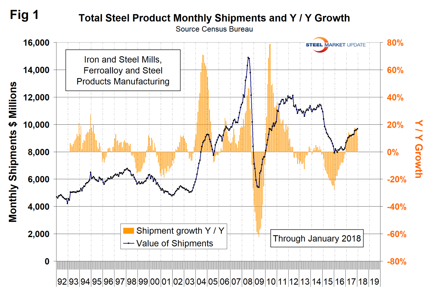
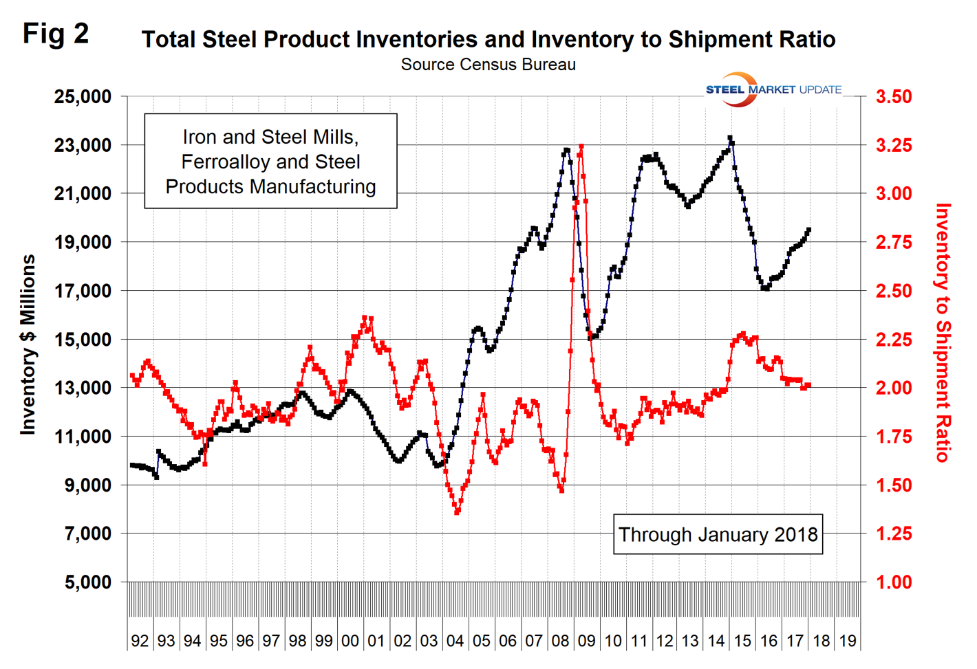
Figure 2 shows total inventory in millions of dollars and the inventory-to-shipment ratio. Since July 2016, total inventories through January 2018 grew by 13.3 percent, but the inventory-to-shipment ratio declined from 2.09 to 2.01 in that time frame. The ratio is down from 2.26 in January 2016.
SMU Comment: We try to review several different sources of comparable data to verify our conclusions. In this case, we are comparing American Iron and Steel Institute shipment data and MSCI inventories data. Figure 3 shows total rolled product shipments since 2003 based on data from AISI. Comparing Figure 3 with Figure 1 is not apples to apples because one is tons and the other is revenue dollars, but still the Census Bureau data looks more believable.
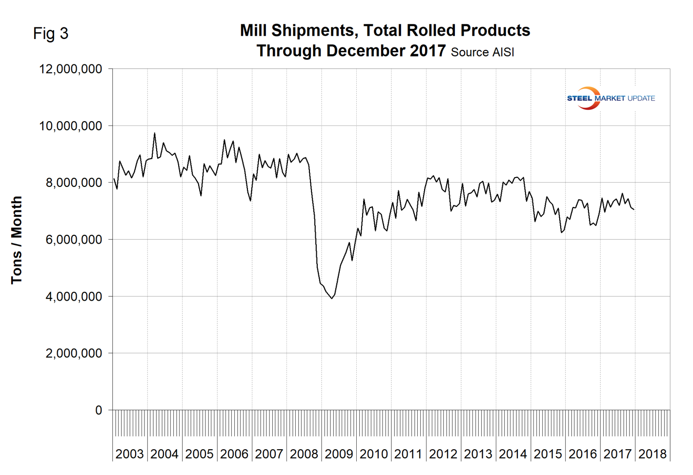
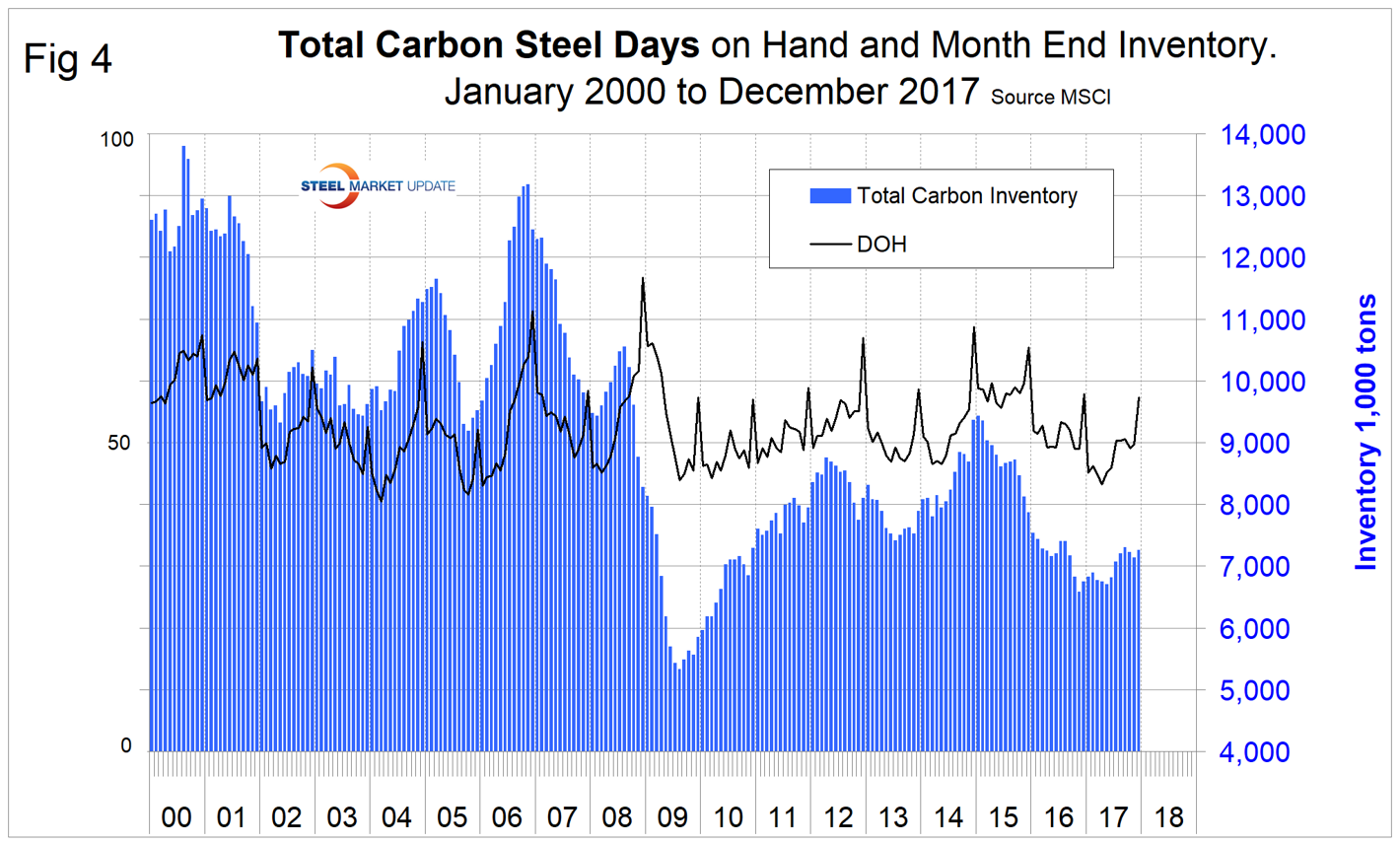
Figure 4 shows total service center carbon steel inventories as reported by MSCI. Again, comparing Figure 4 with Figure 2 is comparing tons with dollars, but the comparison looks quite good. The recession at the service center level was much worse than in the Census Bureau inventory data, which makes sense.